A high-end brand needs a high-end first impression
Coast Innovated Builders transforms upscale Naples homes into personalized luxury escapes. Their work speaks for itself, but the logo they started with didn't. It came from a previous designer and didn't match the look they were going for.
I listened closely to their concerns, then designed a new identity from the ground up: a mark with meaning and intent, and a palette that gives off exactly the vibe they wanted.
A logo that didn't match the business
The original logo leaned on a literal state outline and a heavy, blocky wordmark. It didn't feel luxurious, and it wasn't going to speak to the upscale homeowners Coast wanted to attract.
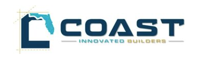
Blocky and literal. It didn't reflect the look they were going for.
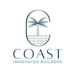
Refined and intentional, with a luxurious, coastal feel.
Every detail has a reason
The name became the palette
Their name is Coast, so I took inspiration from the colors of the ocean coastline: deep teal-navy, sea blue, and a soft misty neutral.
A refined C
An elegant C represents the brand while giving it a luxurious style. The thin line work and spaced lettering feel custom and high-end.
Imagery that belongs here
The water and palm tree inside the C are congruent with Southwest Florida foliage, so the mark feels rooted in the place they build.
Color palette
The identity, on their website
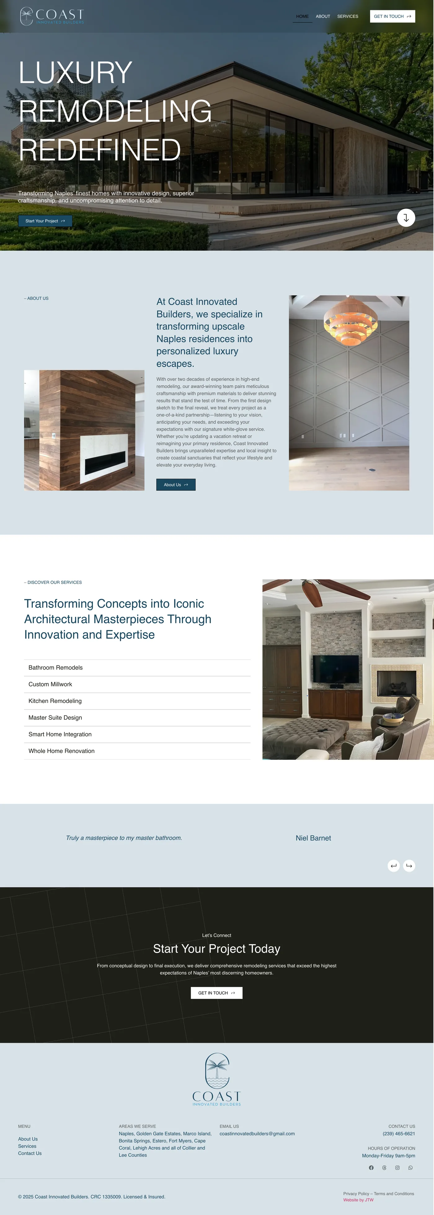
The new logo and palette carry through the site, from the header to the footer. Scroll the preview to explore it.
Want a brand that speaks to your audience?
I only take a couple of projects a month, so each one gets my full attention. Tell me about your business and I'll reply within a day.