A logo doesn't have to say what the industry is
Damir, the owner of Direct Contracting & Renovations, came to me with an AI-generated logo he didn't love. It was generic, and it could have belonged to almost any contractor.
I started from the font he did like, built a new logo around it, then extended that logo and palette to his express landing page. He loved it.
An AI logo that could belong to anyone
The AI-generated logo stacked a skyline, rooftops and a long tagline on top of the initials. It was busy and generic, and it didn't help him stand out from every other contractor in the market.
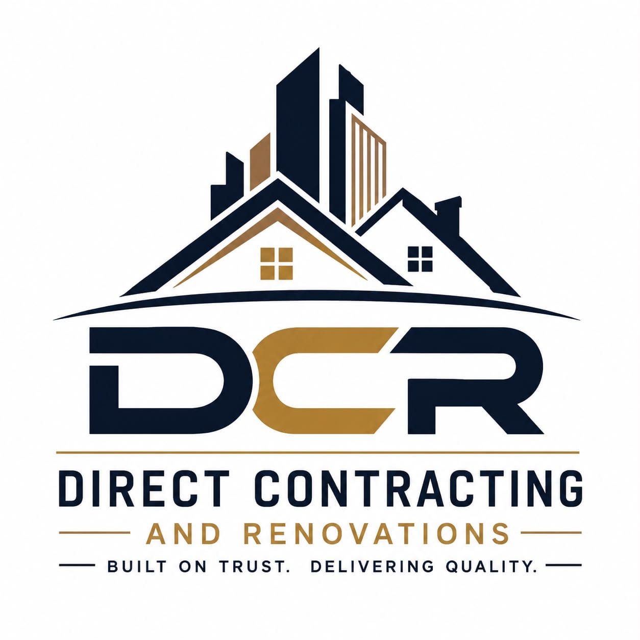
Generic building clip art and too many elements. Not a logo Damir loved.
Bold, simple and unmistakably his.
Simple on purpose
Built from a font he liked
Damir liked a particular font, so I took inspiration from it and applied it to his logo. The custom letterforms give the wordmark its own character.
Identify, don't explain
A logo doesn't always have to say what the industry is. It has to identify the company and differentiate it from the others, and a distinctive wordmark does exactly that.
Colors for his customers
He liked black and wanted to contrast it with gold. Copper keeps the contrast without feeling too high-end, so budget-conscious homeowners don't assume he's too expensive.
Color palette
A business card that says exactly what it needs to
I designed Damir's business card to match the new identity. The front is simple and communicates exactly what contacts need to see: his name, role, phone, email and website. His full logo sits on the back.
The identity, on his express landing page
I extended the logo and palette to a one-page express site built to turn visitors into calls. Scroll the preview to explore it.

Want a brand that speaks to your audience?
I only take a couple of projects a month, so each one gets my full attention. Tell me about your business and I'll reply within a day.